
Tennis Channel
Multiplatform Product Set


Overview
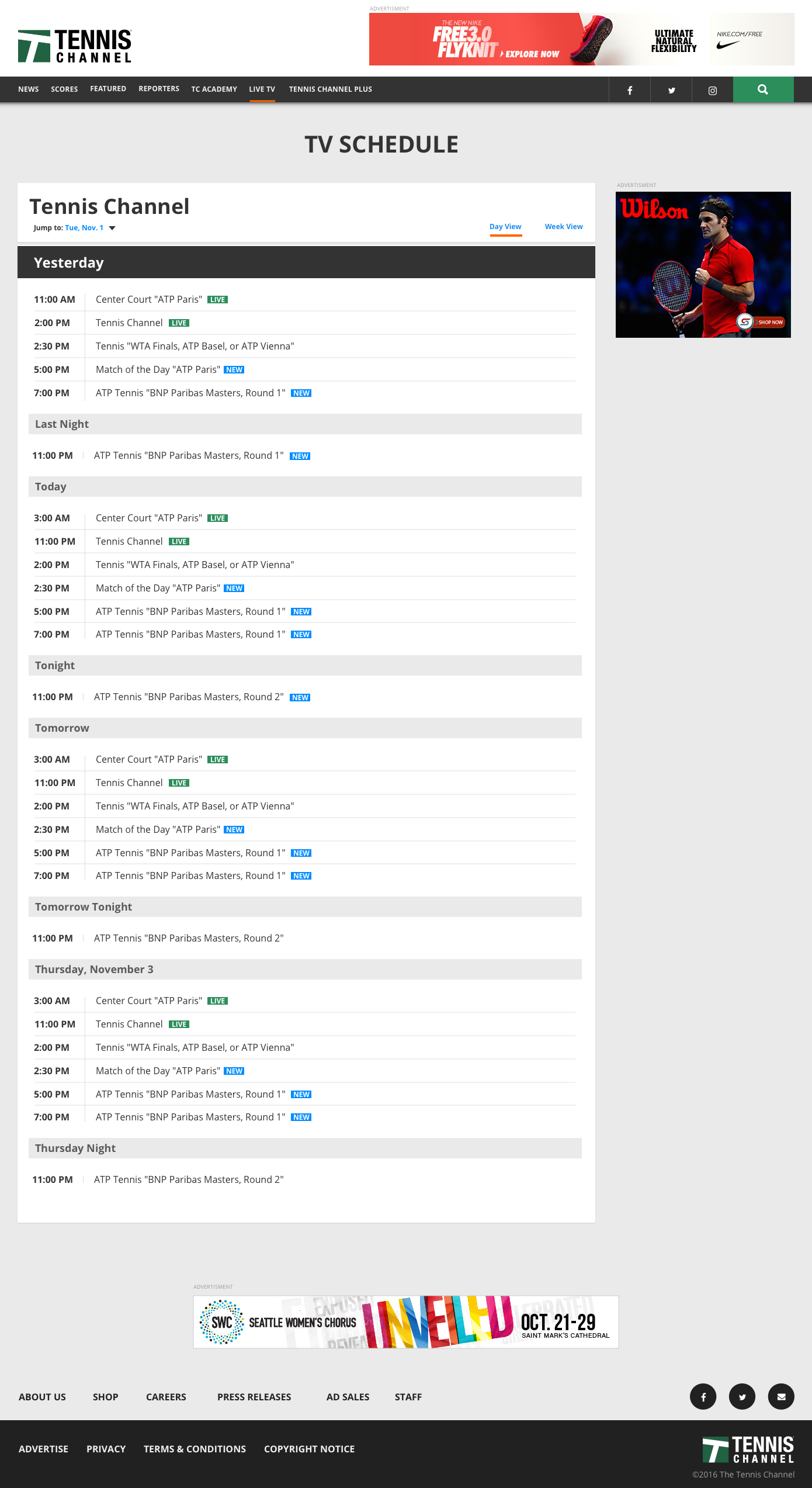
Sinclair Broadcast Group's goal was to expand their reach by diversifying live and on-demand video distribution platforms. The first step of this initiative was to design a product set for the Tennis Channel, a traditionally cable based service with some apps built on a third party platform. Building apps for streaming boxes, web, smart TV and mobile apps on an internal platform would help cut cost and make content management and publishing easier as well as create an infrastructure for other Sinclair owned brands. This was the opportune time to improve the user experience of the Tennis Channel Everywhere applications.
involement
I partnered with one creative director, two product managers and one other designer to translate concepts into features, define the product and prioritize for launch. We collaborated to create a product set for iOS, Android, Roku, Apple TV, Fire Tv and web. I conducted user research including surveys and interviews as well a qualitative user testing. I executed and delivered flows, wireframes, prototypes and design specs for iOS and the web. I presented these works to gain sign off from executives, senior stakeholders and other teams throughout the project lifecycle.
October 2017 to March 2018
View Site: tennischanneleverywhere.com
Who are our users and what do they want?
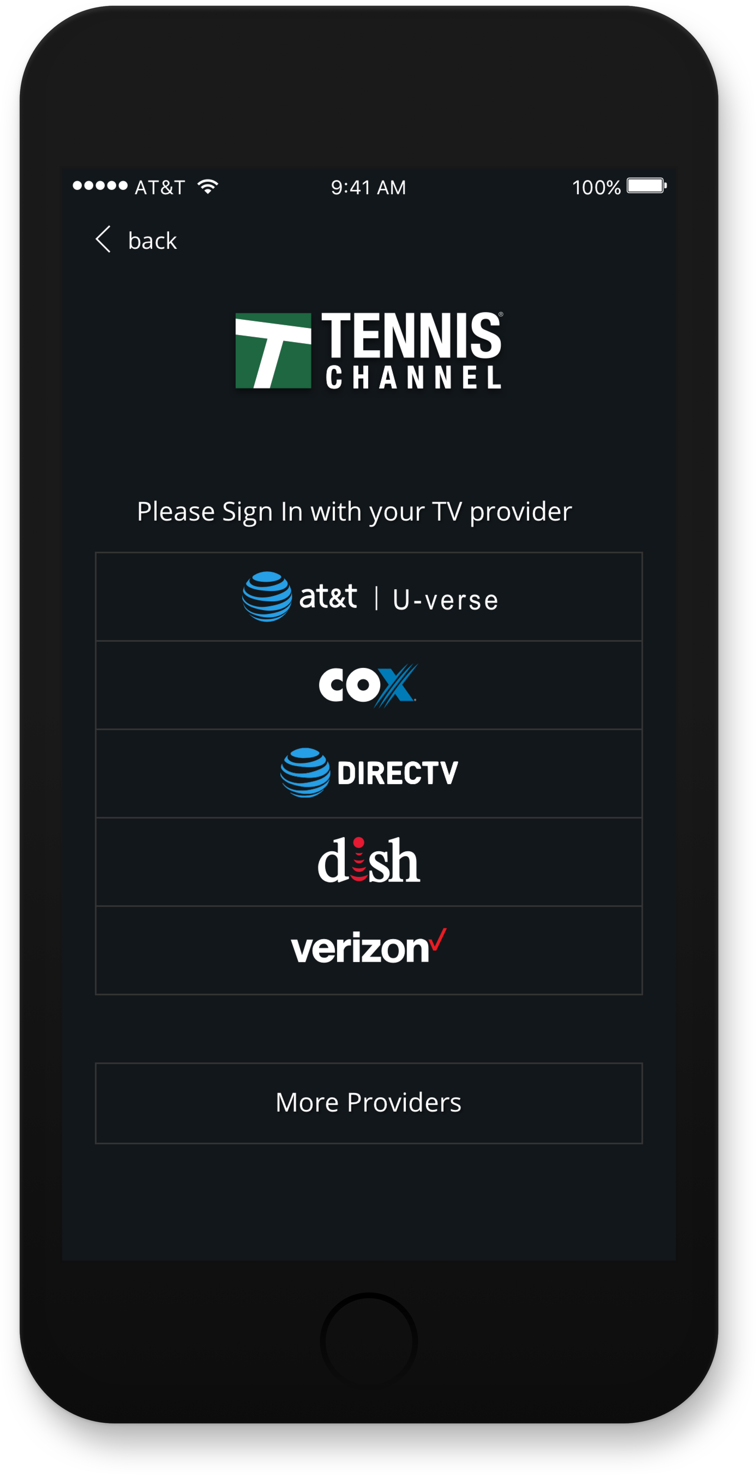
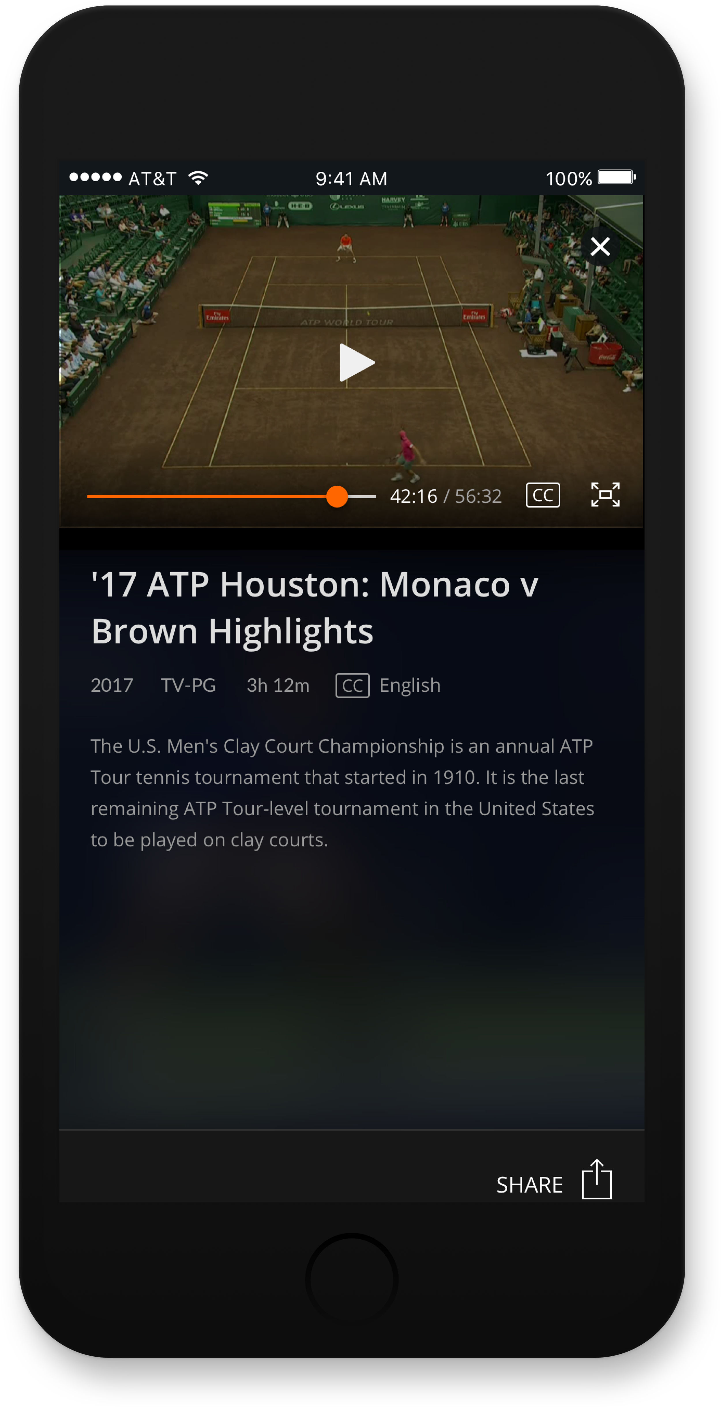
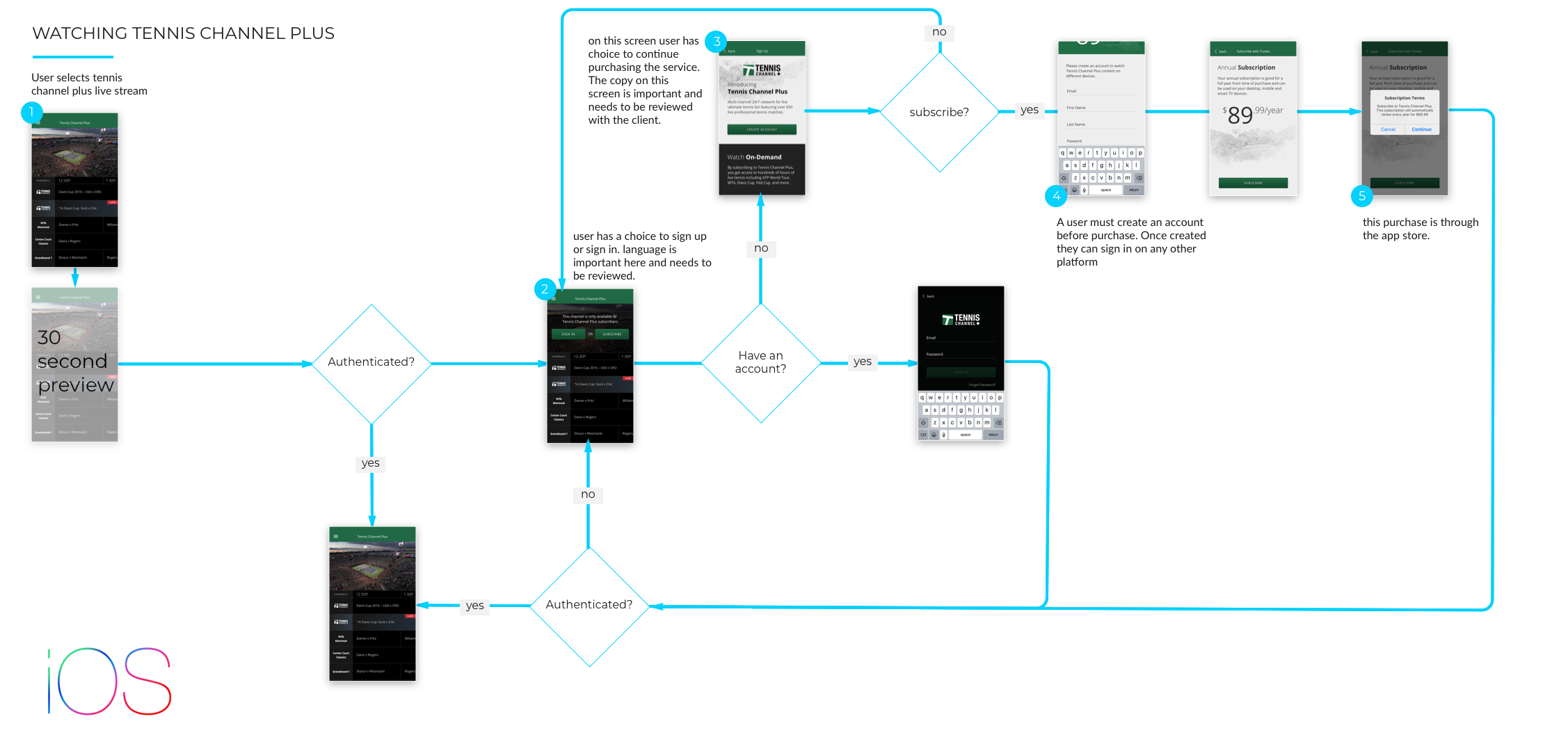
Tennis Channel users need to authenticate using their cable provider login (Multichannel Video Program Distributors (MVPDs) or Tennis Channel Plus credentials to watch premium content. They must purchase a subscription to Tennis channel Plus in order to watch premium Live and on-demand Tennis matches.
Primary user needs
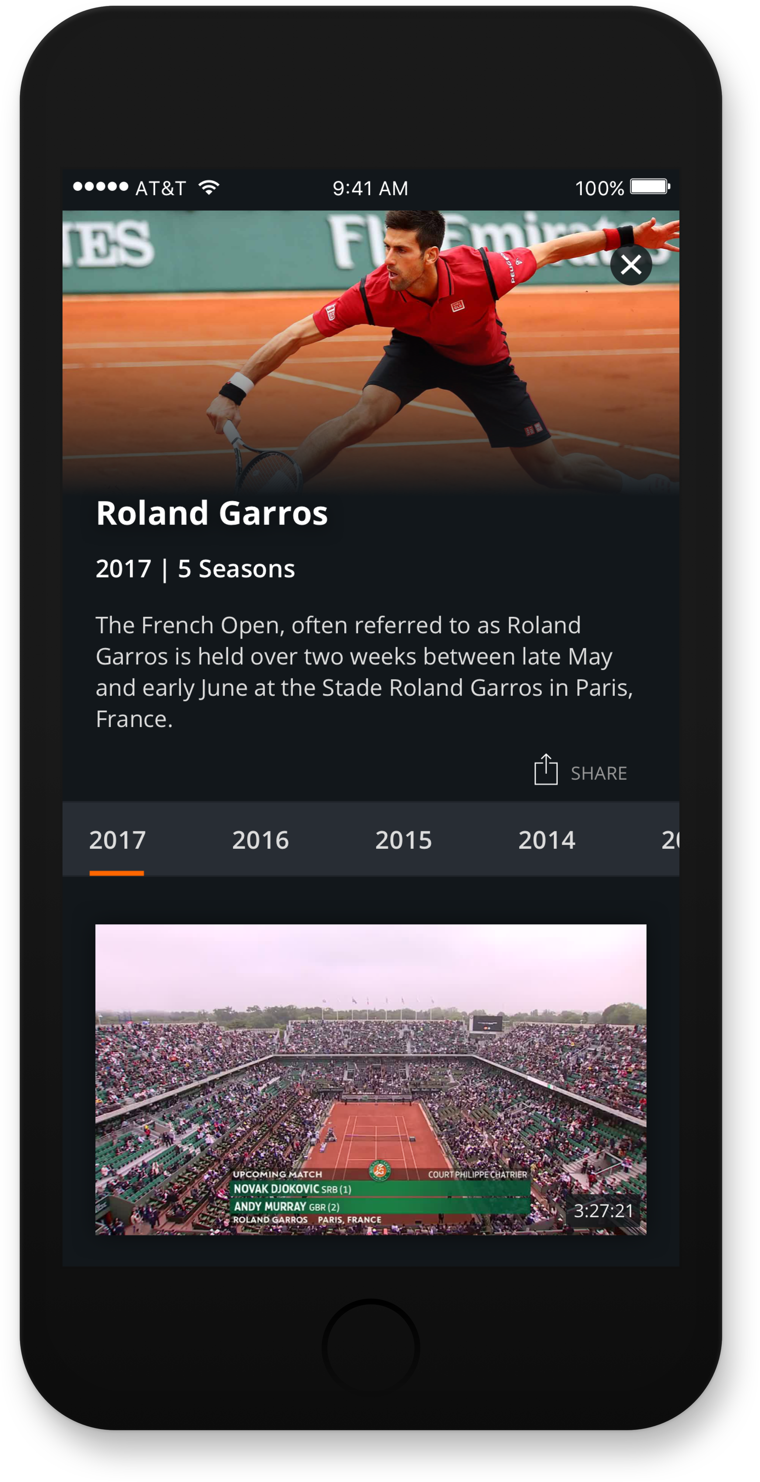
Users want to watch free, live and on-demand content and browse matches by tournament. Users need to be able to browse channels on the linear program guide to see when matches are scheduled and view
up to three days worth of content. Users must have the ability to search for matches by a player’s name or tournament.
System Flow Diagrams
After conducting research and defining user needs, our team met for collaborative whiteboard sessions in which we worked out details and illustrated how the system would operate. I then translated these rough ideas into polished diagrams to outline the flows, identify screens needed for design and communicate with the engineering team.
User Flows


User Testing
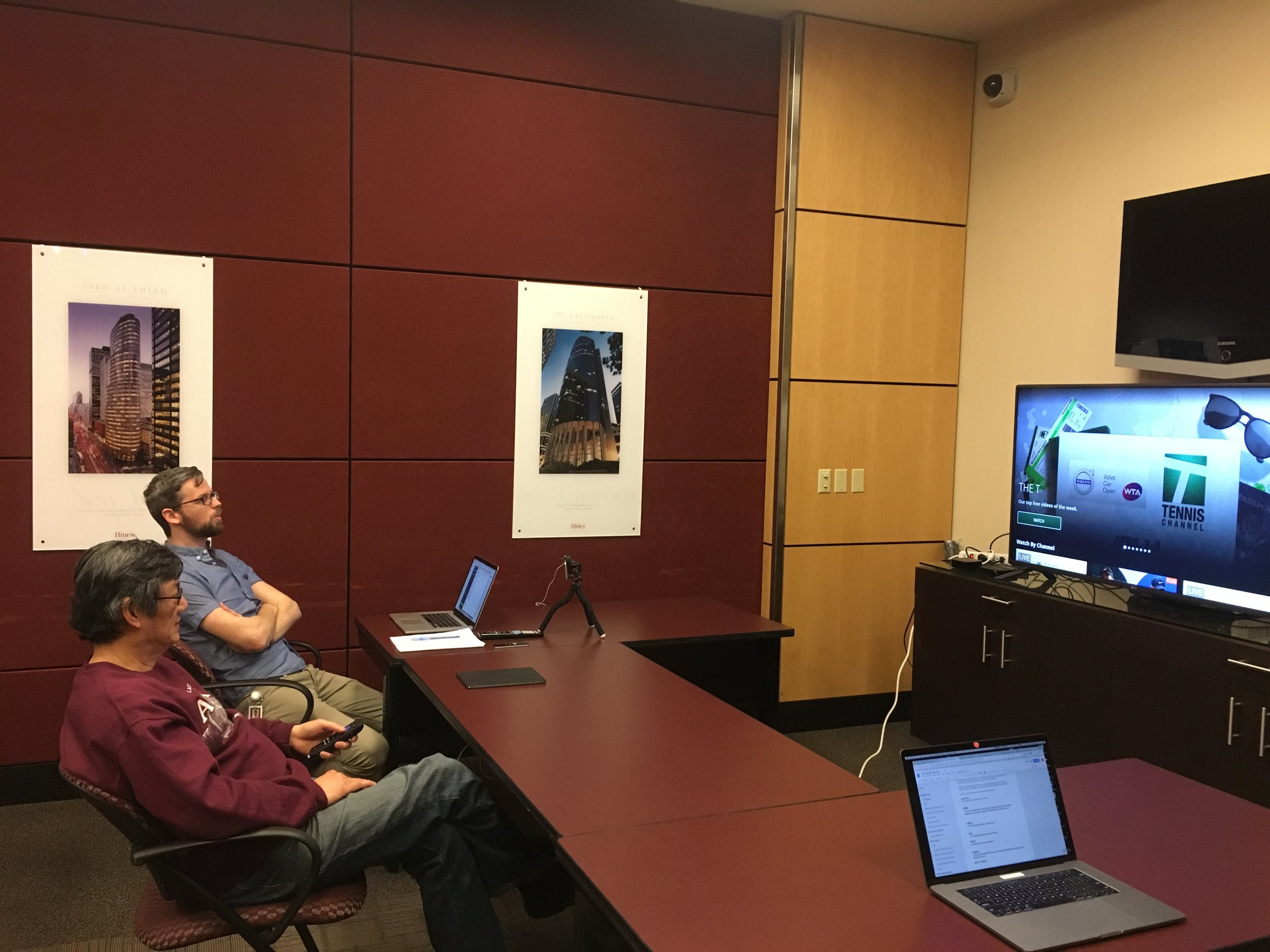
We first created surveys to prescreen participants for the study and set the qualification criteria. Then established key tasks to observe and created a rubric to track task completion. We developed a set of questions for the user interviews, conducted a qualitative study with 14 participants, recorded the findings and analyzed data. We then presented those findings and recommendations for the next steps and improvements needed to move forward.
Tasks Included:
Browsing content
Navigation
Searching for content
Accessing and using the “Program Guide”
Accessing and using the “Show” screens
Completing MVPD authentication
Brief summary of findings
Recurring pain points and issues
Button Focus
Description: All buttons, including The ‘Sign in’ button are not highlighted with a yellow outline and people do not seem to know that the button is selected or in focus.
Possible Fix: Add an indicator that it is in focus. Perhaps add a yellow outline to the button when selected.
Show Seasons Focus
Description: There was some confusion whether or not users had this selector in focus or not. It seems once they landed on it they thought the seasons would change as they moved their cursor and would not have to hit ‘ok’ to change what season was displayed.
Possible Fix: Add an indicator that it is in focus. Perhaps add a yellow outline to the ‘Season Name’ when selected. Consider changing season when ‘Season name ‘ is in focus without hitting ‘ok.'
Instructions Unclear
Description: The instructions on Roku are more clear then on AppleTV on how to authenticate.
Possible Fix: Make the instructions more descriptive. Use Roku authentication instructions on other platforms.
No Confirmation
Description: When a user successfully authenticates via on tennischannel.com/activate, they do not receive a “Success” message or confirmation screen.
Possible Fix: Provide a success or confirmation message on the website upon successful authentication. Provide messaging that explains that the content should now load on their TV.
Form Field Accessibility
Description: The form field on tennischannel.com/activate is not accessible. It is too dark for everyone to see where to enter the code.
Possible Fix: Make the field lighter to increase contrast with the dark background. The directions for engaging the program guide were determined to be unclear.
Description: The hint comes up from the bottom of the screen and disappears after a few seconds. It frequently goes unnoticed. ( How frequently?) One thing to note is that the gradient behind the hint should have more contrast. It may have been improperly implemented.
Possible Fix: Leave the hint on the screen for a longer amount of time
Unable to locate Navigation menu
Description: Most people could not locate the nav unless they accidentally stumbled upon it.
Possible Fixes:
1. Leave the menu hint up on the screen for a longer amount of time or have it persist on all pages throughout the app. Consider moving the hint to the top left side of the screen. Closer to where the nav appears.
2. Consider moving the nav to the top and have it showing upon entry of the home screen.
Better Descriptions on Teasers
Description: People expressed that they would like to read more info about the program before they clicked into it and started watching. Player ranking and dates came up a few times.
Possible Fix: Add more info on teasers or have a detail page. Make the teaser info more descriptive.

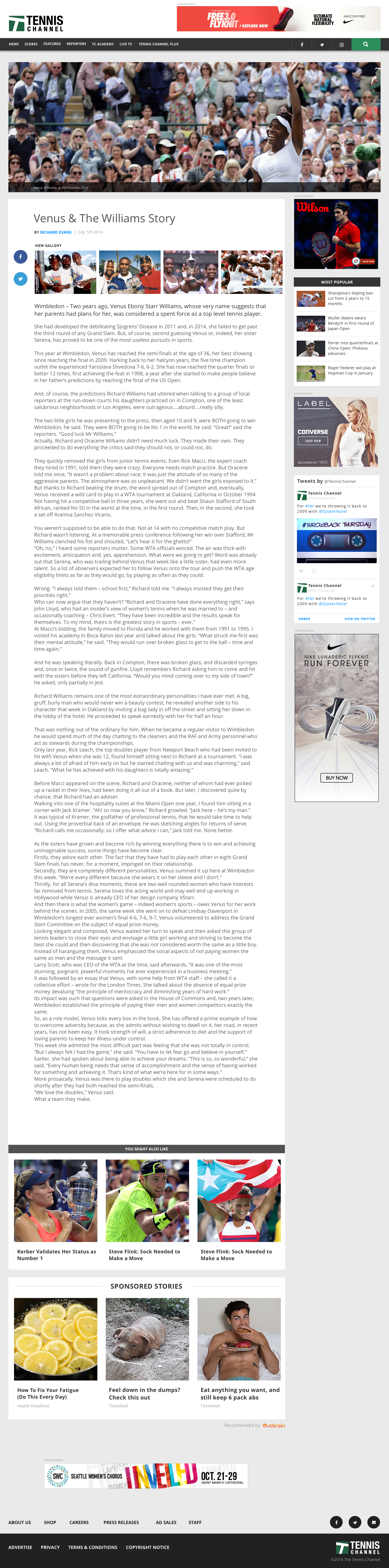
Tennis Channel News Site
Overview
There was a need to redesign the news portion of the Tennis Channel before the watch experience was designed. I partnered with one creative director and one product manager to prioritize goals and concepts for the Tennis Channel news experience. In favor of speed to market, we took a bottom-up approach and leveraged existing web templates and components built in-house.
Involvement
My challenge was to visually style the look and feel in order to reflect the Tennis Channel's brand and to design custom features for user needs that the current theme did not support. I introduced a new, clean design language and card style inspired by material design.
My involvement: July to October 2017
View Site: thetennischannel.com
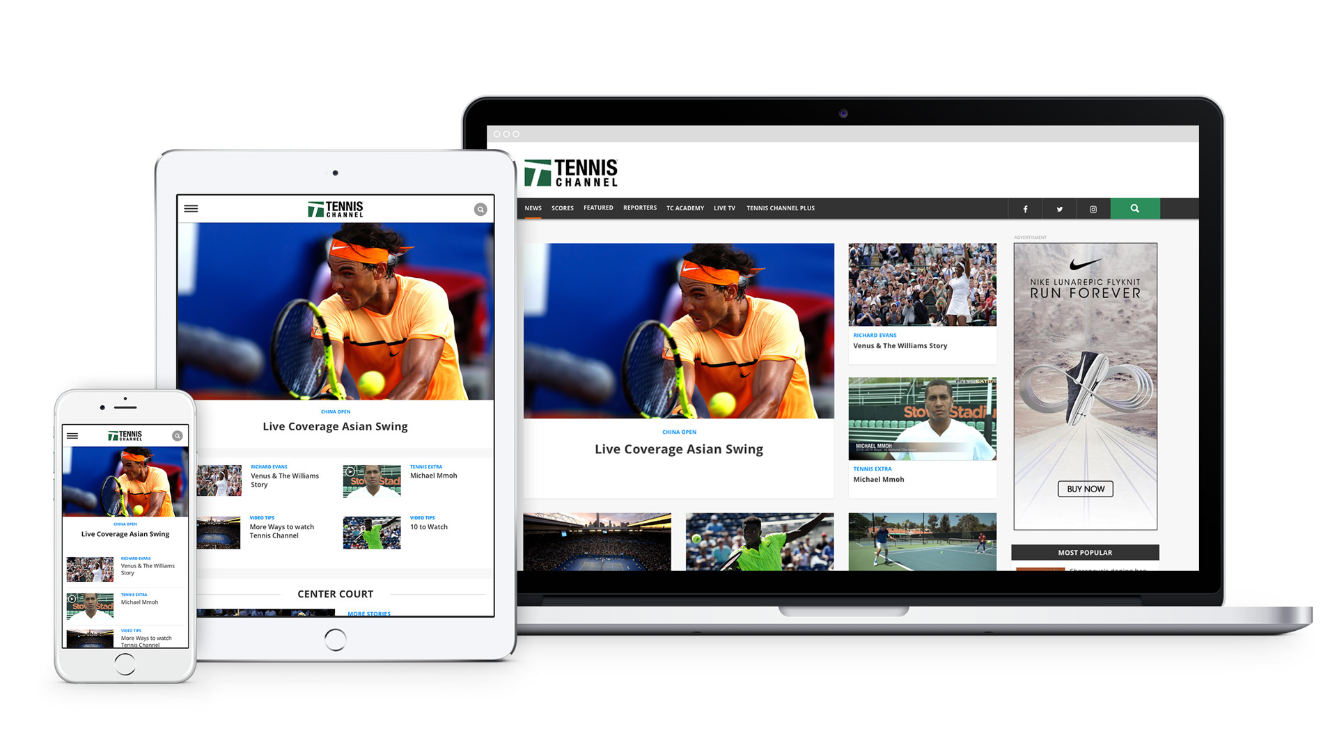
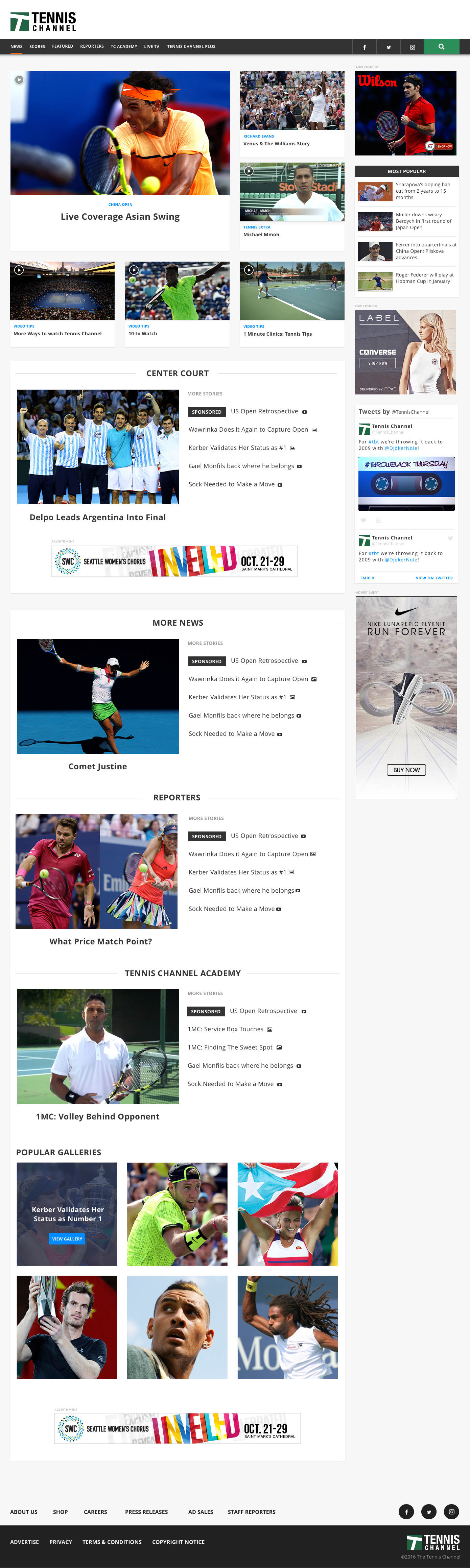
Desktop Layouts

Art Direction
A common question when conducting user interviews was the desire to learn more about the athletes while browsing matches. I created some concept images for the player profiles' experience.

